


Redesigning the core
In 2023 Envato set out to redesign the core platform, Elements. This included a new brand, interface design and design system.
The goal was to modernise the UI, reduce design and technical debt and set the platform up for future growth. We worked with marketing to define a new brand image: digital meets human. This aimed to speak the language of our creative audience.
I was the first product designer on the project, helping to lay out the core foundational elements in close collaboration with lead marketers, engineers and our head of design.
A growth plateau
We wanted to address three core problems.
- Subscriptions had plateaued
Active subscriptions had stopped growing through 2023, with surveys revealing poor customer perceptions of Envato content as well as the brand in general. Our design looked dated, it made people question the quality of content we were selling, with some users even assuming Envato was a scam or fake product. - The existing design system was struggling
The existing design system was struggling with both technical and design debt, accumulated as the system had evolved from a first release back in 2016. This included a difficulty in adapting to new features, accessibility issues, poor use of visual space and many technical issues slowing down feature releases. - Stalled decisions and future-proofing
The working group had achieved significant buy-in from leadership, but were struggling to make major progress on brand and product design decisions. We wanted to start work on product design and implementation, but with many opinions on brand positioning, needed to set ourselves up to flex the product design depending on the exact direction the brand went.
Laying the foundations
- UI Audit and competitor analysis
I undertook an audit of the current platform, including products that the system would likely stretch to include later, to determine: needs, core flows, shared components and where effort should be focused. I combined this with competitor analysis and mood-boards to help set a shared idea of product design direction. - Recurring decision centric meetings
I ran regular meetings with the core group of stakeholders with the primary purpose of making decisions on styling, components and direction, and documenting these decisions to reduce back-and-forth. - Foundation design system and critical path
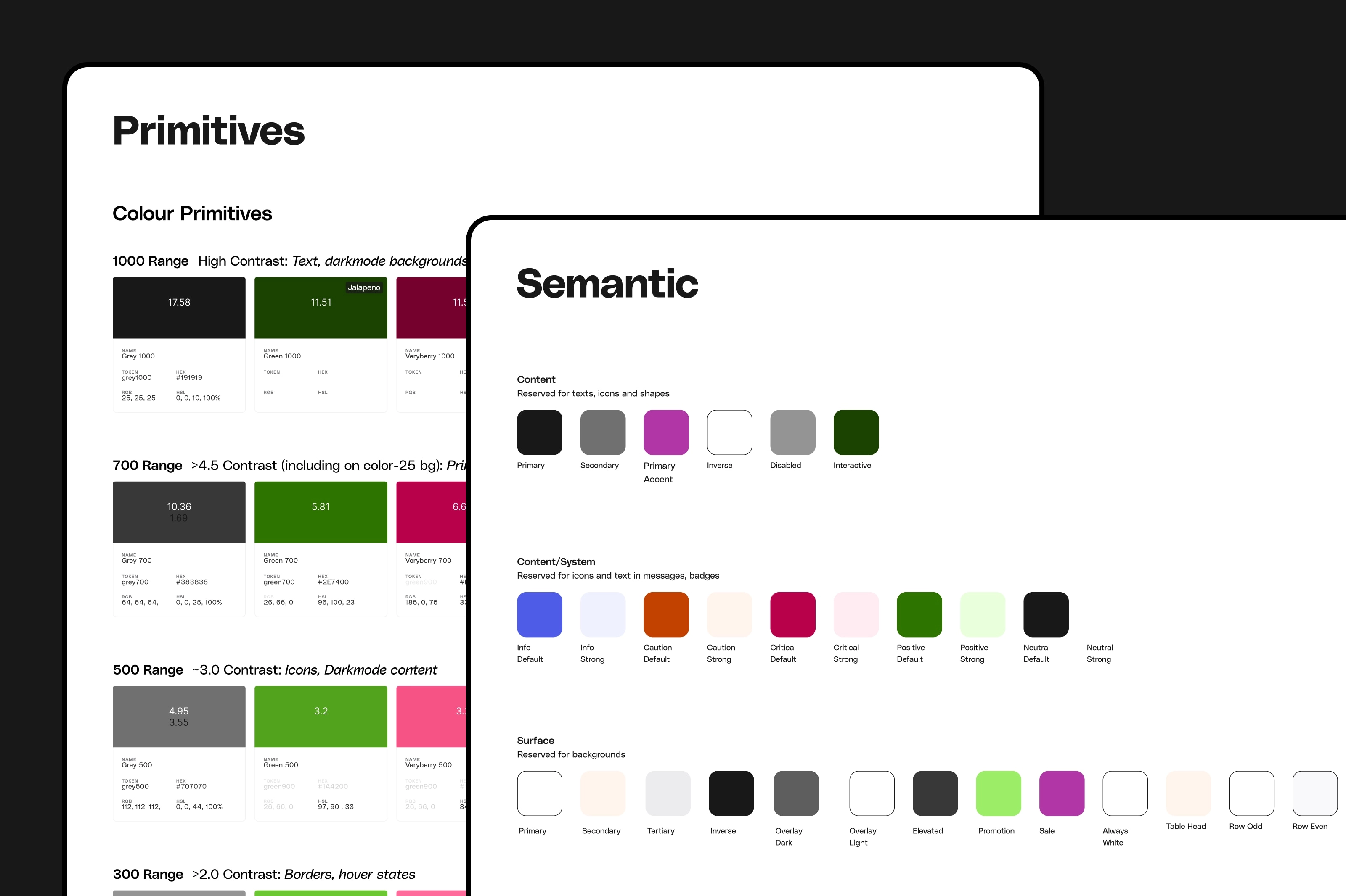
Initial design work focused on the critical path (search, preview, download) and the tokens and styles needed to support this. I also worked closely with engineering to determine the best approach especially regarding tokens and styles, settling on a primitive + semantic token approach that would enable a more shared language between design and engineering. As well as setting us up to flex the design to suit future brand direction and enable features like dark-mode in the future. - Pairing with product designers
Once we had achieved further buy-in from leadership with an initial direction, scope and significant support from engineering and well as marketing and other stakeholders, we brought on additional product designers (many thanks to Sean, Yuji, Ann, Adam and Danny) as the project progressed to get it done, build team ownership and polish the bits that needed polish.
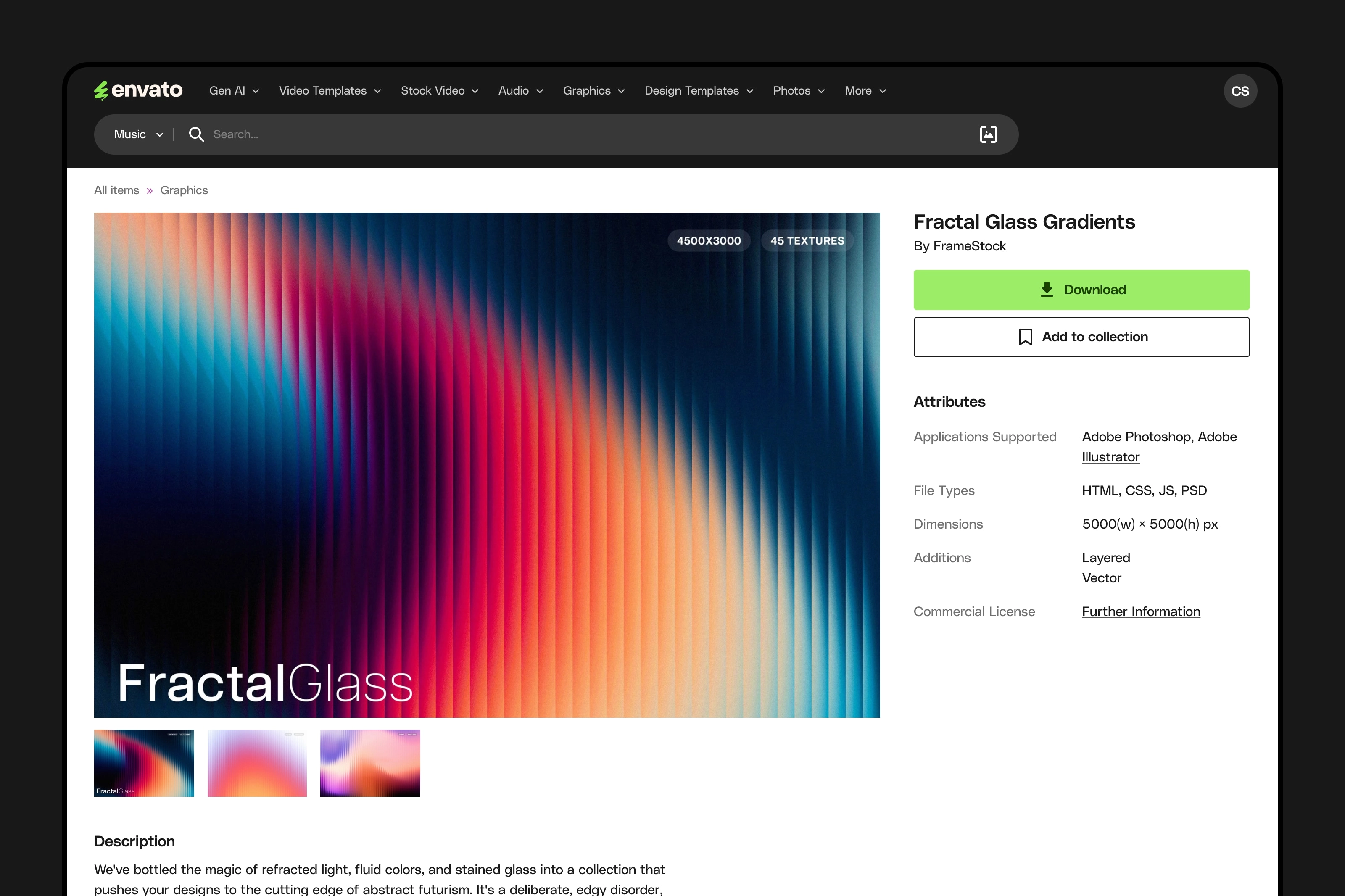
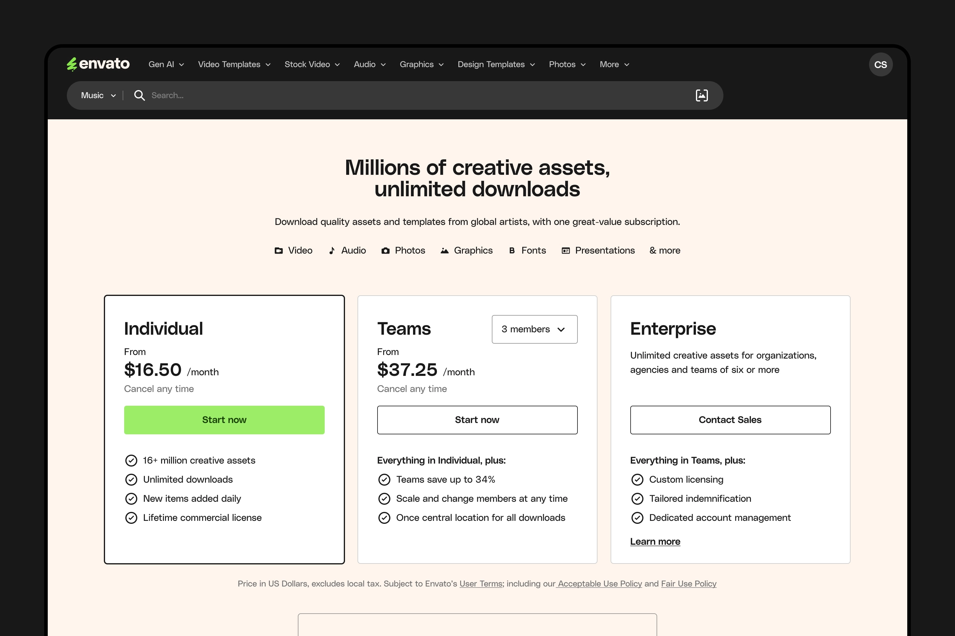
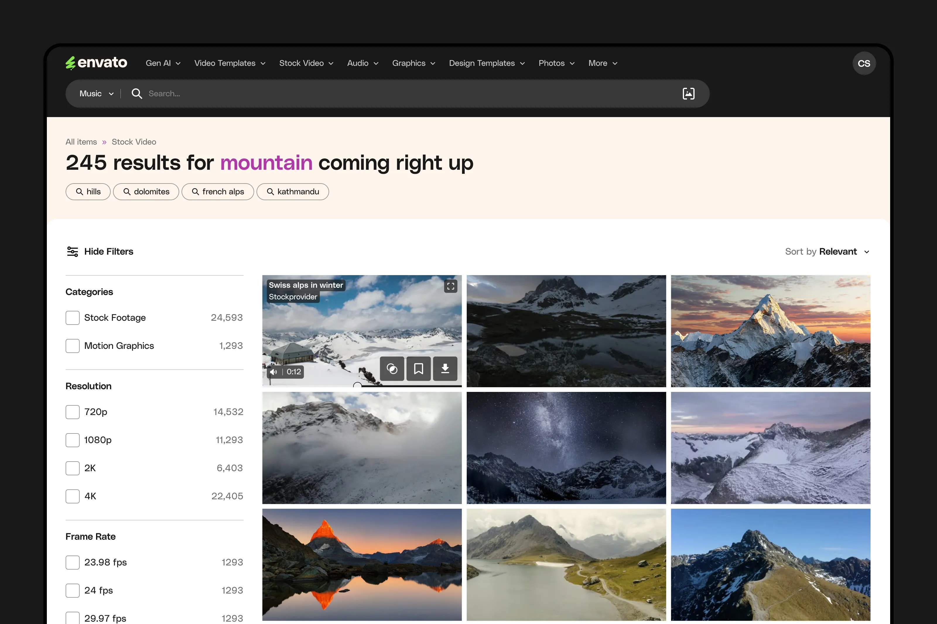
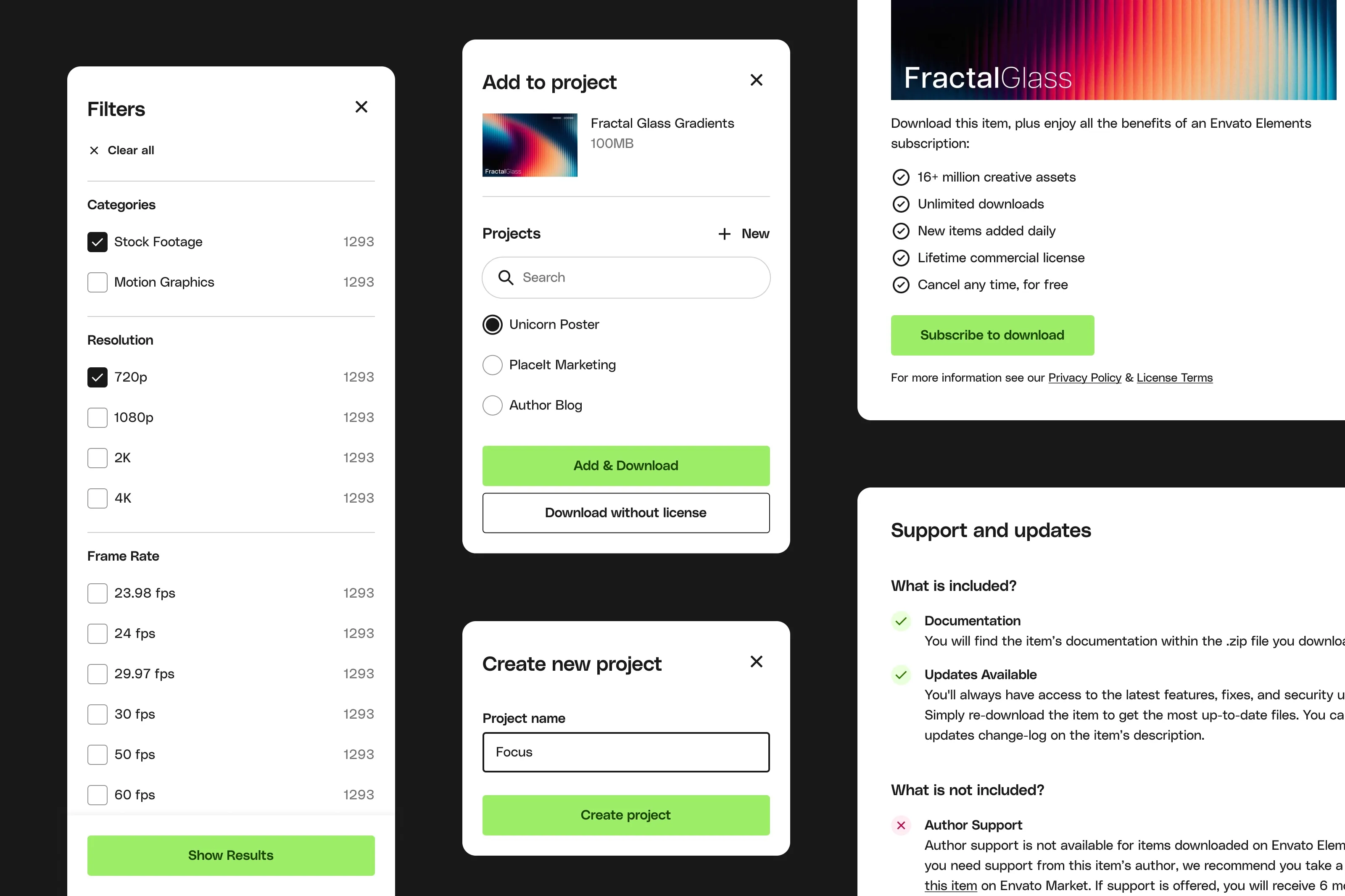
How it started
This was a huge team effort: moving from initial design direction; to the establishment of our core Figma library; onto our core flows; extending to wider pages; and in particular working with a number of engineering teams to implement this in a maintainable, accessible way.


Evolution & refinement

Design drives growth
This was also a pivotal moment in Envato’s culture. Making very obvious the impact that design can have and starting a shift to a more product-led approach rather than one traditionally dominated by engineering.

- Return to growth following release
The rebrand attracted attention within the design community, resonated well with our users and made the site more pleasant to use. This resulted in a return to growth for the business (this trend began before changed to marketing spend). - Positive reception from users and design sites
Surveys following release highlighted a very positive reception, site and brand was also featured on a range of design blogs attracting traffic and attention. - Ability to roll out dark mode in a sprint
The semantic colour system we developed enabled us to add dark mode a year later with minimal work, about a week of developer and designer time.
End result